A few weeks ago, I wrote a story called Three Beauties in West University: Large, Medium, Small HERE – about three houses with very different price points and sizes. The smallest was an original bungalow and according to the comments, a lot of you really loved its interiors. At the time I imagined the homeowner was an interior decorator, but actually Ashley Goforth was the one who designed its fresh interiors. Ashley is from Houston and after graduating from the University of Texas, she started working for Renea Abbott who owns Shabby Slips HERE. Renea is one of the better designers in Houston and I would imagine working for her is worth 100 times more than a college degree in design. It was at Shabby Slips where I first met Ashley – going in and out the store. She stayed there for six years and in 2005 branched out on her own with Ashley Goforth Design. Sine then she has really been busy designing houses in and out of Houston. Looking over her portfolio, I was amazed at how much work she has done – and all of it is so great looking! She has a very distinct and elegant look, working mostly in soothing colors without much pattern except in curtains or pillows. It’s a streamlined, eclectic and timeless look with contemporary pieces mixed in with antiques. Ashley was kind enough to share some beautiful photographs of her latest work. So, enjoy – I know I did!!!
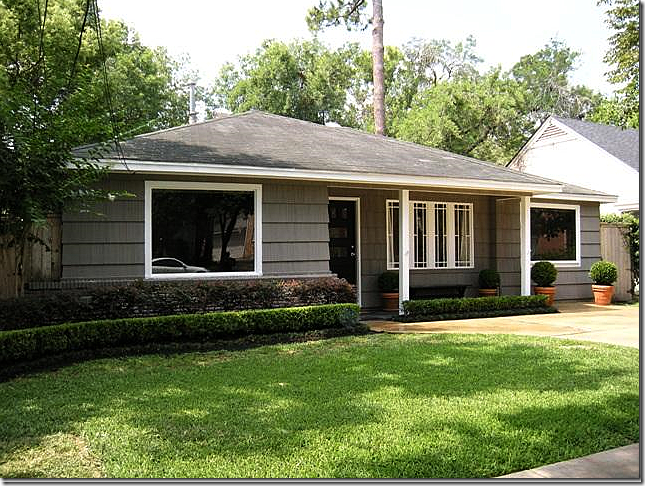 The original bungalow shown a few weeks ago, designed by Ashley Goforth. The owner emailed me to say that Ashley is working with her on her new house in West U. Hopefully, we’ll get to see the finished project!
RICE BOULEVARD: These high res professional pictures look so much better than the small pictures on the real estate site. Stephen Gutierrez took these photographs and can be contacted at: sg@stephengutierrez.com. Ashley’s work is often very symmetrical. Often there is a linear component: Here, notice how the coffee table’s cross bar is repeated in the end tables. As usual, the only pattern comes from the pillows, which are always perfectly plump and properly sized.
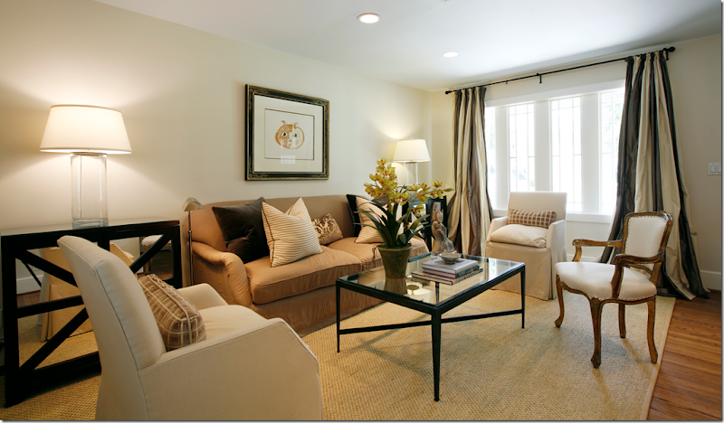 Ashley likes to mix the contemporary with the old: new end and coffee table sit next to antique chairs and chest.
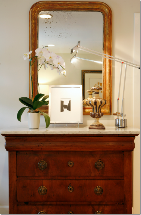 I love the surprise of the contemporary stainless lamp mixed with the antique gilt mirror.
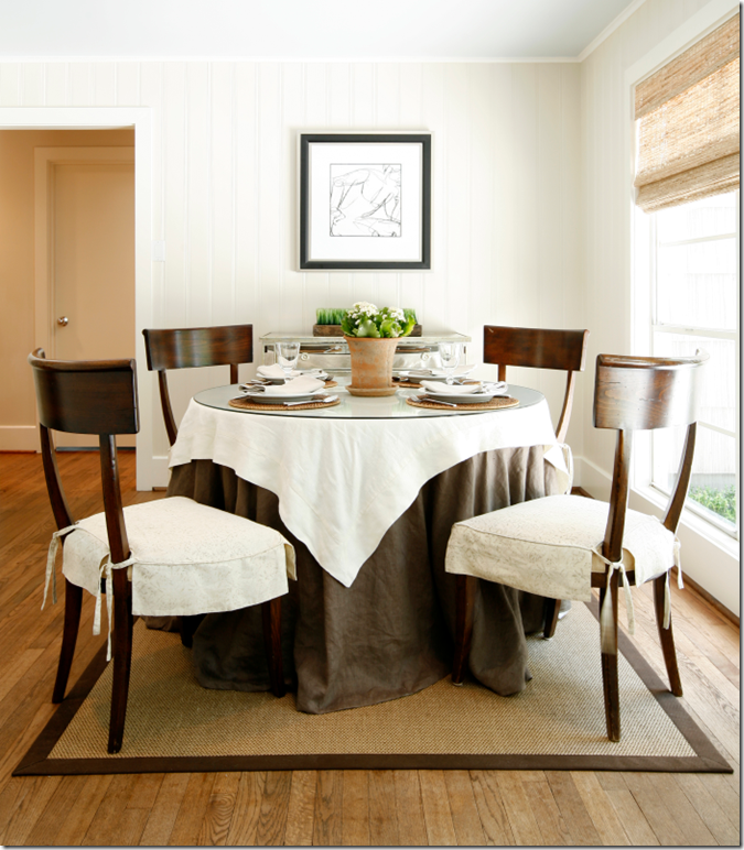 She uses a lot of textured blinds and rugs, along with very tailored slipcovers.
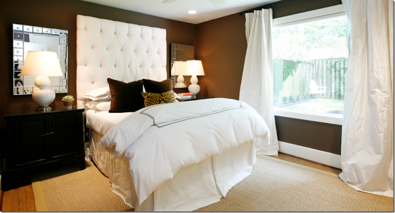 All of Ashley’s bedrooms are beautiful. Here, I love the dark walls mixed with the white bedding and white lamps. The dark velvet pillows are perfect against all the white.
SOUTH BOULEVARD: This next project is located on South Blvd. in a much larger house. Here, Ashley uses mostly antiques for an entry way vignette.
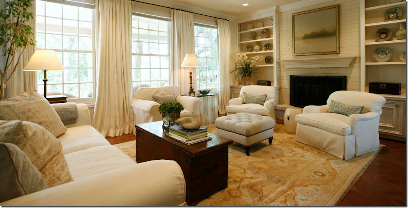
 All white upholstery is used in the living room, along with a classic coffee table. When not using seagrass, Ashley uses muted area rugs instead. Usually she mixes curtains with textured shades as seen here.
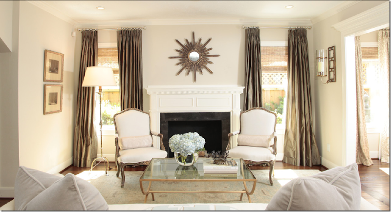 Another view of the living room on South Blvd.
 I absolutely LOVE this dining room! The chairs are so beautiful and I really like the art work, the chandelier and the curtains with their subtle damask pattern. So pretty!!!
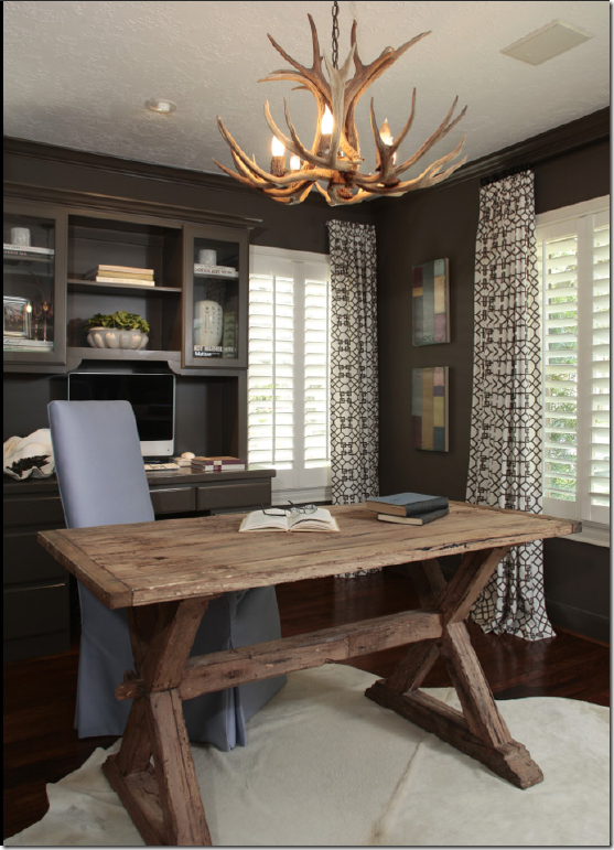
The study is wonderful with a Belgian styled table, cow skin rug, and trendy patterned curtains. The choice of colors is wonderful – the dark black/brown on the walls with the touch of blue against the black and white.
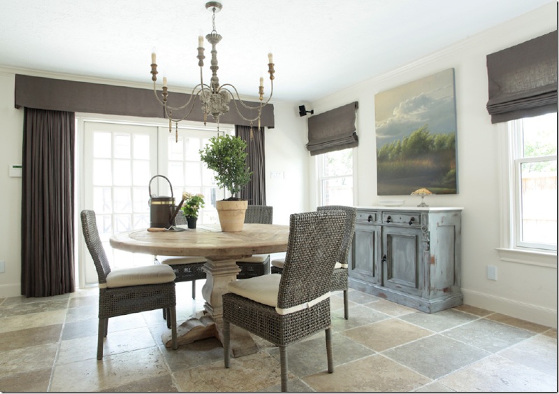 More up to date choices: again, the table has the light washed look, the antique buffet is painted a color that picks up the floor tiles, but the curtain fabric makes the room. The dark linen is so unexpected but that is exactly why it works. Love how it all ties together with the dark chandelier and chairs.
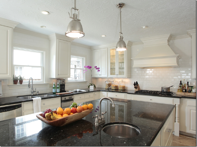
The kitchen is black granite and white subway tiles, while the pendant lights and stove hood set it apart.
qw The sitting room is all taupes and aquas. Again, the upholstery is solid, with pattern found just on the pillows and ottoman – allowing for easy design changes years down the road. Ashley choices of graphic pattern fabrics add youthfulness and freshness.
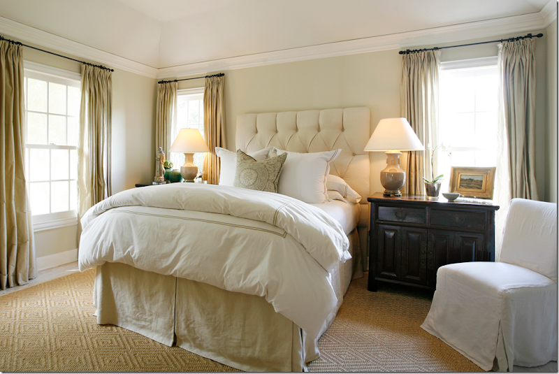
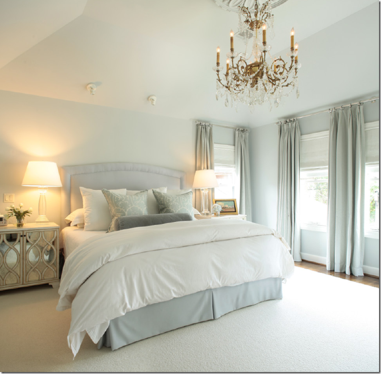 The master bedroom: Ashley’s bedrooms are always just the prettiest. She typically employs the unmade duvet look with no patterned fabrics except for a few pillows. Here, the lamps and nightstands are contemporary. The chandelier is gorgeous. So beautiful.
NEW BRAUNFELS, TEXAS
This house in New Braunfels, Texas is on the river and the interiors are more casual. There are slipcovers in linen, pine furniture, and warmer colors, along with a subtle area rug. Rose Tarlow prints on the sofa pillows.
 Close up of the fireplace and shelves. Ashley’s pillows are always so perfect, the size and the down stuffing. I assume she learned that at Shabby Slips. Their pillows are also exquisite!
It’s hard to see in the pictures, but the curtain headers and trim are darker which gives it just a hint of definition. I like how she mixed two fabrics on the chair slips here. Notice the blue pillows in the host chairs. The light fixture is fabulous. I really love this room too!
 The book filled library. Love the pillows. Again, Ashley usually layers two patterned with two velvet pillows.
Master bedroom: love the patterned rug, the curtains, and the bedding. Does she ever make a mistake???? I haven’t found one yet! Seriously, she really is a great interior decorator.
Guest room balances masculine and feminine sides. The zebra adds the perfect touch.
REBA ST:
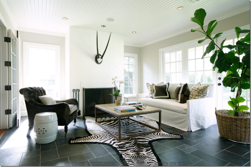
At this house on Reba St. in River Oaks, the family room was designed by Ashley. Details are: tailored slipcover, graphic patterned pillows, zebra, and the one lone horn on the mantel that becomes sculpture.
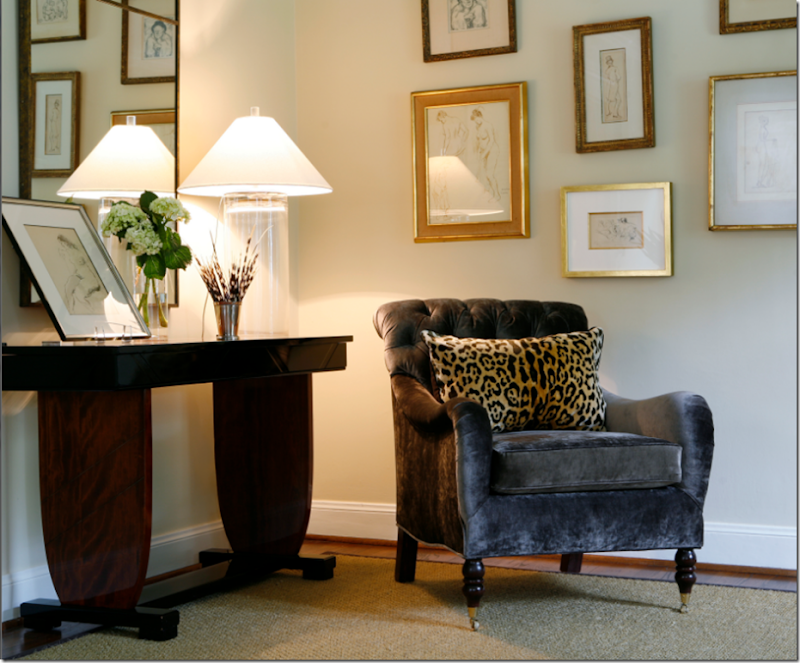 Vignette from the living room on Reba.
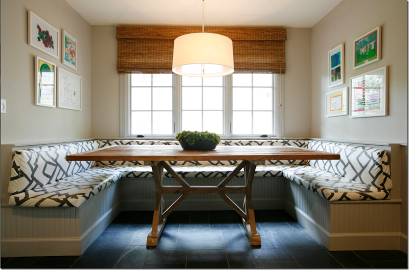
Perfection: breakfast room with built in booth. The graphic gray and white fabric picks up the color in the slate floor. The wood table adds another color matched by the shades. The framed art work is by the owner’s children. The round pendant is the perfect shape to counteract all the squares.
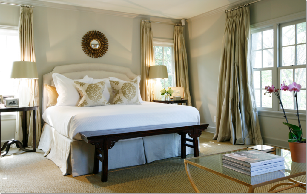
Another beautiful master bedroom. Here she added an oriental bench to the end of the bed. Luscious curtains, as always. Two patterned pillows.
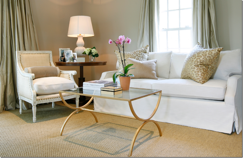
This sitting area is right across from the master bed. The slipcovers are always tailored to perfection, something she probably learned from Renea Abbott. Notice her pillows – how plump they are! How great their size is!! Just wonderful.
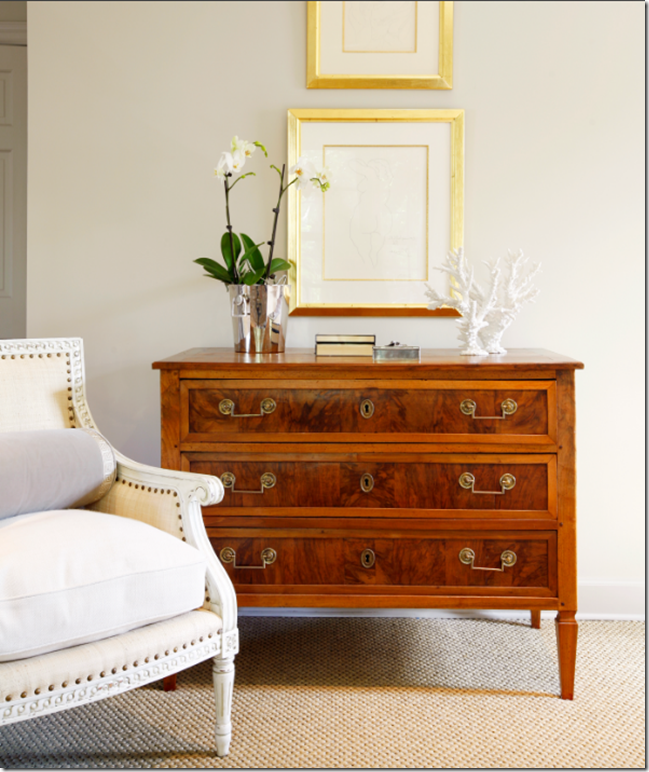 A vignette from the master bedroom. Mixing the classic with the contemporary.
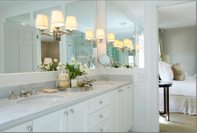 The master bathroom has white marble and wonderful sconces inset into the mirror.
SAN ANTONIO:
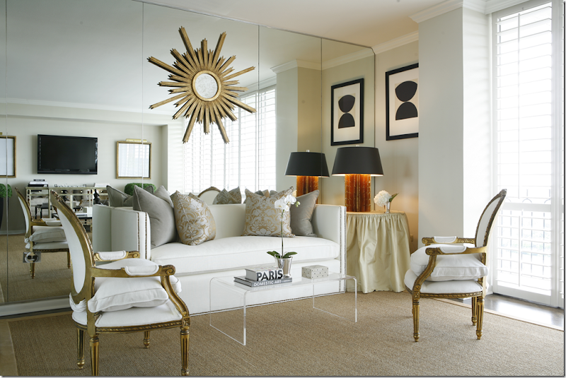
These interiors are located in a high rise in San Antonia, Texas. The large living room is divided into two seating arrangements. Here, dressy gilt antique chairs are juxtaposed next to a contemporary sofa. The pillows, damask and velvet, bring the color gray into the room. According to Ashley, the client asked for a gray and white palette and didn’t want anything brown, including wood furniture. She also didn’t want anything to wrinkle, so there were no slipcovers (though Ashley’s slips really are not the wrinkled type!)
 The other side of the living room – Ashley’s interiors are often very symmetrical and balanced. Here, the TV is balanced by large gilt framed prints and a mirror console. The gray is continued in the sofa’s fabric. The contemporary coffee table is balanced by the antique chairs.
 Close up showing the wonderful downed filled cushion on the chair. I love how the graphic patterned pillow plays off the shutters.
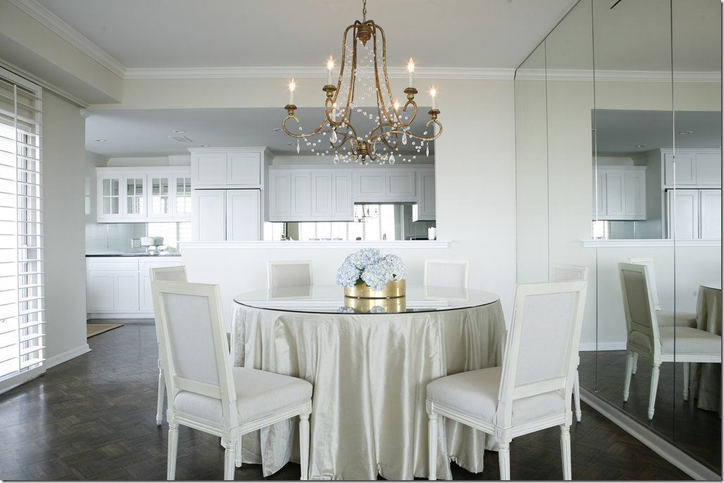
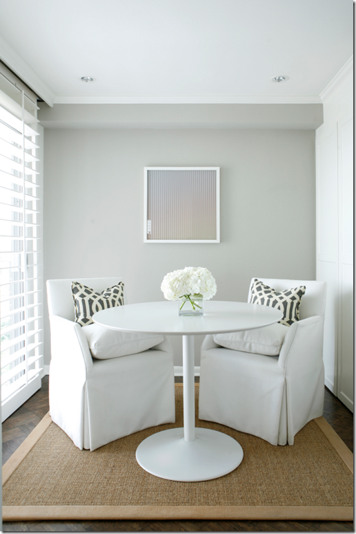 The breakfast room. Grays in the KWID pillows and paint play off all the whites. Wonderful chairs.
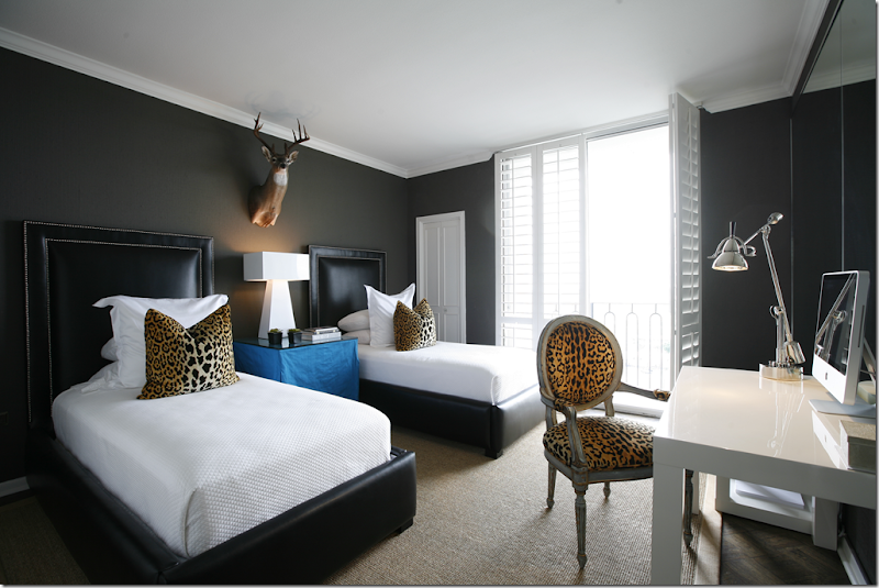 The guest room. LOVE the touch of Yves Klein blue here!!!! Perfect against the dark brown walls. And I love the touches of leopard. Notice how she brings in the classic, soft lined, French chair mixed with all the contemporary furniture with hard edges. The deer head add just the right touch. Beautifully executed room, IMHO.
SUNSET BOULEVARD:
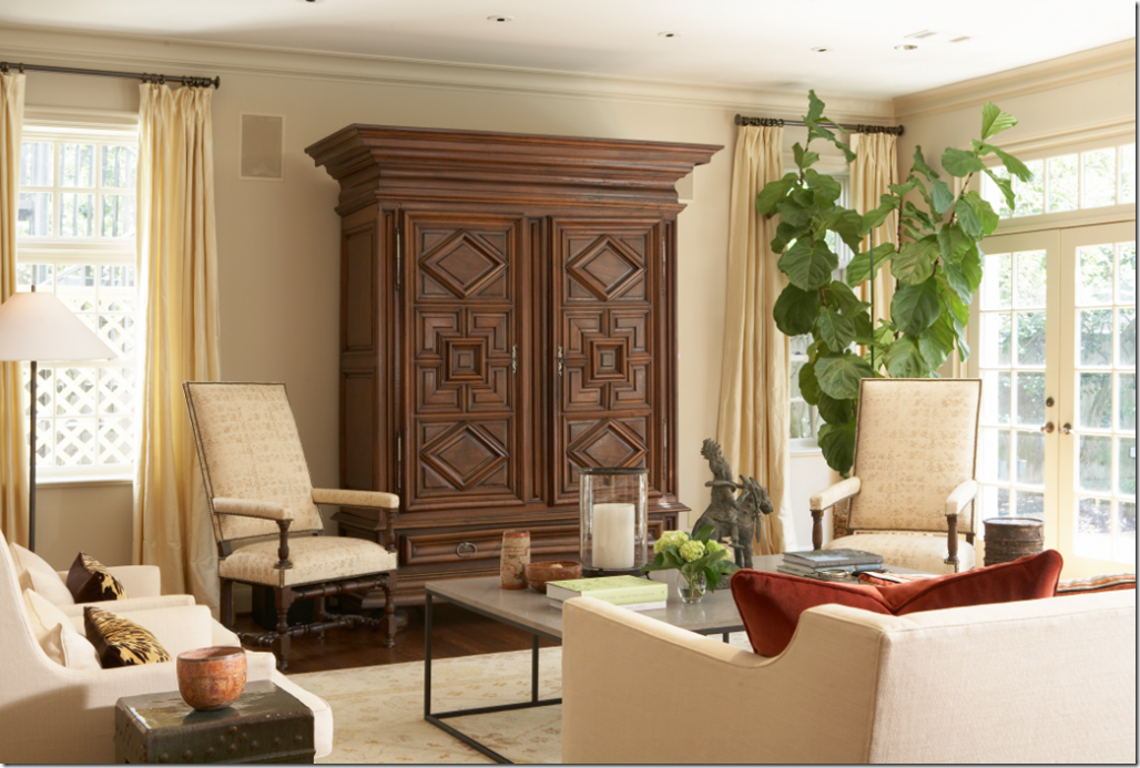
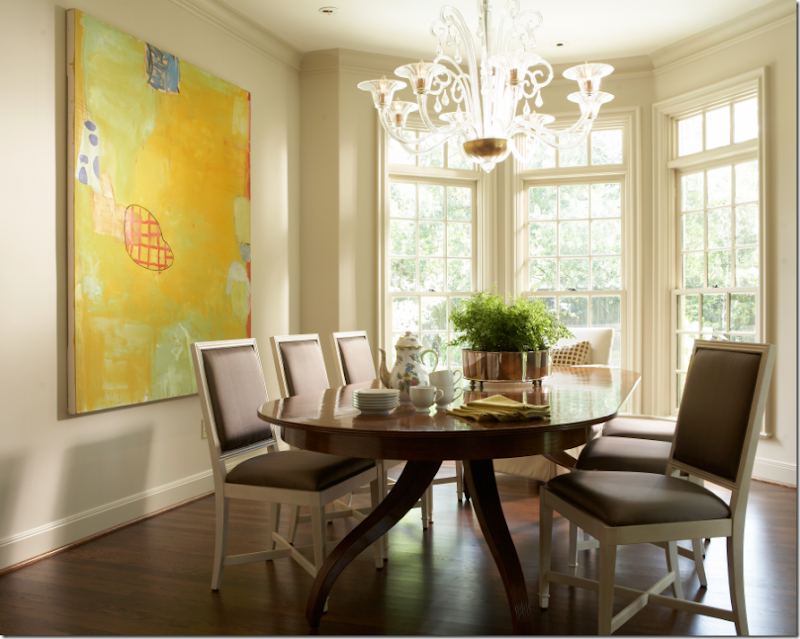
Large contemporary art work dominates the room. The glass chandelier is just perfect against the dark wood table.
 A vignette, balancing the antique with the contemporary. Ashley’s lamps are always either simple glass cylinders or colorful ceramic vases. This chest is gorgeous.
 A pair of gilded antique chairs play against the contemporary sofa and coffee table. Subtle patterned area rug. Again, pillows bring in the pattern.
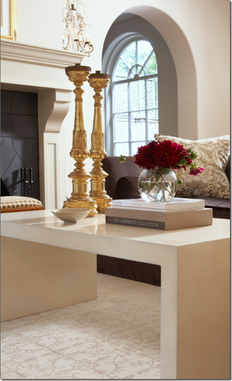
Closeup of Ashley’s accessorizing – always elegant and sparse, never cluttered.
 In the adjacent closed in porch area, a large oriental screen covers the back walls. Beautifully styled desk.
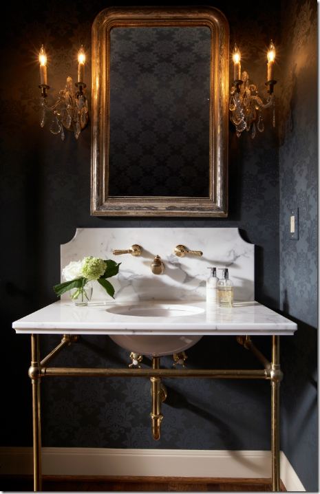
 Beautifully designed kitchen with large island, black and white countertops, and wonderful wall of windows. The textured shades warm up the decor as do the counter stools. Love the symmetrically placed topiaries.
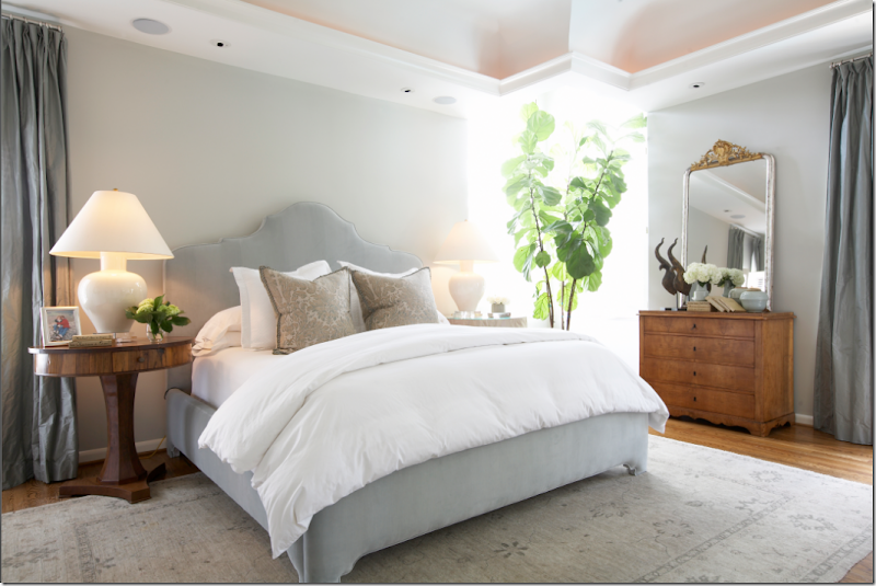
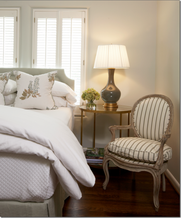
I LOVE the headboard – it’s so thin, not tufted, no nailheads, just elegant. Notice the feet on the bed, so gracefully carved. Beautiful. Love the blue blush color. The rug is so gorgeous too. Love the pillows, the lamps, everything!
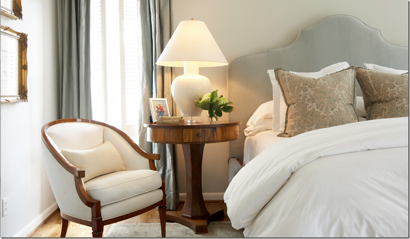 Close up of the beautiful table and headboard.
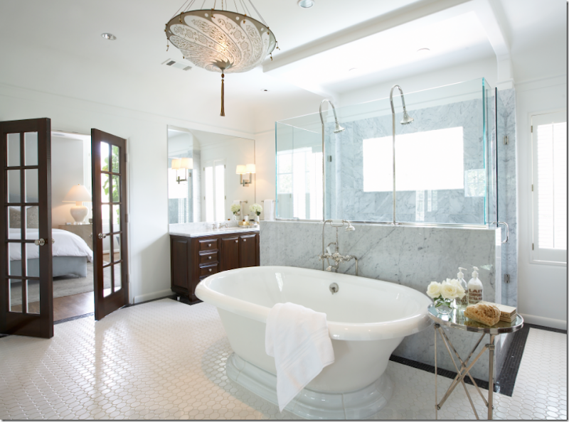
Master bathroom is to die for: the shower!!!!!!! Whoa. That tub. Love the dark cabinets with white marble countertops. Love the French doors opening to the bathroom. I would want to look into the bathroom from the bedroom too!! And notice the Fortuny light fixture. Renea Abbott’s husband sells those fixtures at his store Creative Flooring.
And finally, the guest room. Grays and whites with hints of browns. Again, so pretty. I have yet to find anything that Ashley designed that wasn’t pretty!!! She is truly talented, she is young and has a long and successful future ahead of her.
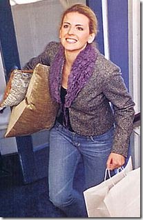
Mrs. Goforth, hard at work!
I hope you’ve enjoyed looking at these elegant designs by Ashley Goforth. There are a lot more pictures on her web site, so be sure to visit it HERE. The pictures were taken by Stephen Gutierrez – email him here: sg@stephengutierrez.com
A huge, special thank you to Ashley for sharing all these photographs. Thank you a million times!!!!
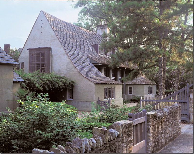 Bobby McAlpine’s house, design inspired by Edwin Lutyens. 1
AND just a reminder, Bobby McAlpine is on this week’s Skirted Roundtable, HERE. Listen. He’s fabulous.
